We have moved! Please head to http://www.lavieenbeaute.wordpress.com if your browser does not automatically redirect you. Please update your bookmarks with the change! La Vie en Beauté: Eyeshadow

Introduction

Welcome to my abode of pretty things (:. Continuing Oscar Wilde's aesthetic one beautiful possession at a time.

Bulletin Board


IMPORTANT: I will ALWAYS disclose which products I have received from companies free of cost. I will never write sponsored or paid articles. Products sent to me are sent for consideration only, and are not guaranteed a good review. Unless otherwise indicated, everything reviewed are products purchased by me.

La Vie En Beaute is formerly Diamond in the Rough at thoughtsofeverythingandanything.blogspot.com. Please note the change because Blogger WILL NOT automatically redirect you!

Showing posts with label Eyeshadow. Show all posts

Sunday, January 10, 2010

Review: MAC Hypnotizing


MAC Hypnotizing [right].

This particular eyeshadow [MAC Love Lace collection, December 26 2009] has been garnering alot of chatter recently. Why? Mostly...because its taupe.

As many of you know, taupe is probably the most treasured [I kid you not] eyeshadow color in the makeup world. In its many colors and form, it's one of the colors most everyone loves because they can find one that works for them, and its flattering.

So, when MAC comes out with a warm taupe....what do you get? Tons of buzz and sold units!


Voila...MAC Hypnotizing.

It's a warm taupe, almost not quite taupe anymore, and frosty. The texture is rather dry for a drost but not to the point it's unworkable. It's quite wearable, though it mostly shows up on the lid as a frostly silvery sheen rather than alot of color. It doesn't crease on me over UDPP.

Overall, definetly a worthwhile item to pick up at only 14.50$ USD :) Available nationwide.

Thursday, January 7, 2010

New Dior Quints

Supposedly reformulated and the colors are supposed to be more vibrant. However, these are not Iridescent. From Sephora:

Old Night Dust:


New Night Dust:


Old Stylish Moves:


New Stylish Moves:


NEW: Mystic Smokes


And Extase Pinks:


Ooh la la! So gorgeous. I want them all!! Especially Mystic Smokes & Extase Pinks...

Sunday, November 8, 2009

Review: Lavshuca Eye Color Duo in PU-1

I posted pictures of this very pretty duo a few weeks ago and began to use it as everyone was asking for reviews. When I tested these duos in store while in Asia, they seemed buttery, pigmented and perfect. They even swatched well......but sadly didn't apply that great.
Look how gorgeous that purple is! It matches with the golden champagne color well, and it was the only reason I chose this duo over the other, rather drab color choices. I am pleased to say that the texture of both was pigmented and silky and shimmery with bits of glitter shot through.

My highest hopes had been for the purple, but it wound up being the champagne gold color that wowed me. It turned more golden once applied and really brightened my eyes. The purple though...it turned a drab mauve tinged grey once applied. (I used sponge applicators for higher color intensity, I find brushes don't work that well with Japanese drugstore eyeshadows).

The shadows lasted through a day with Urban Decay Primer Potion as a base with minimal creasing on my oily lids.

The packaging is minimal, with the burgundy wine color that I've come to associate with Lavshuca. It's quietly elegant and I like that it has a clear windows so I can tell what color it is.

I bought this for about 7$ retail price in Asia.

The bottom line: it's a good starter duo, especially for the golden shade, but if you have a stash like me, don't bother with it.

Wednesday, November 4, 2009

Review: Illamasqua Cry Eyeshadow

Illamasqua. Makeup for your alter ego. One year old British makeup sensation that made it's way across the pond a few months ago.

It's got a lot of hype to live up to, thanks to Youtubers in Britain. Does it live up to it?

..not the eyeshadow, at least.
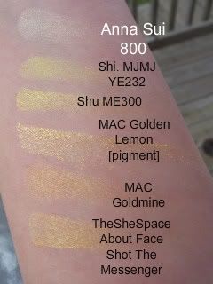
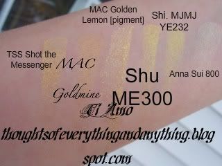
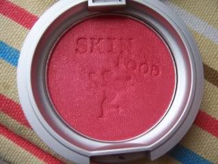
Cry is a cool medium pink that has alot of blue in it. At first I was wary (this was won in a giveaway overseas) of the color, but gave it a try anyways.

Illamasqua. Makeup for your alter ego. One year old British makeup sensation that made it's way across the pond a few months ago.

It's got a lot of hype to live up to, thanks to Youtubers in Britain. Even more by their eyeshadows' description:

Bring a room to its knees without saying a word. Each of these glorious colours makes a statement that's as individual as you are. Highly pigmented, these long-lasting colors ensure all-night intensity. Experiment and be bold.

Does it live up to it?

..not the eyeshadow, at least.
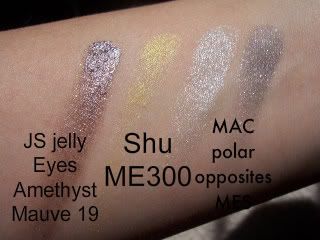
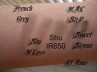
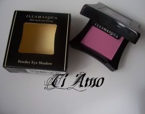
Cry is a cool MATTE medium pink that has alot of blue in it. At first I was wary (this was won in a giveaway overseas) of the color and the finish (LOVE shimmer...wary of mattes) but gave it a try anyways.
Well...it's okay. Mediocre. People were saying how it totally rivaled MAC (didn't crease like MAC on me.....but I don't mind how MAC creases) and 
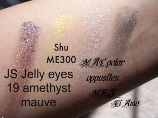
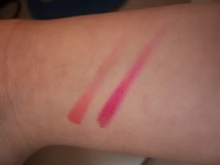
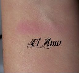
shu. Uh....this formula might be able to beat out MAC's old matte formula (but Matte2 totally destroys Illamasqua), but shu uemura still reigns supreme for me! The formula on Cry felt a bit chalky and powdery, nothing like the buttery textures of MAC Matte2. When I swatched it, I needed to build up 3 layers to get the intensity you see in the pic above.

That's alright, I thought. Alot of shadows apply better on the lids right? Well I had to apply 2 layers of Cry to get it to show and, to my horror, it took on a distinctly warm fuschia feel. What?? Yeah, fuschia. Yuck...I can definetly tell you it didn't look too great.

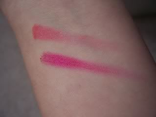
But the color is something that I can change, so lets talk more about the formula. It was kind of dry, and like I said before, a bit chalky and had a 'dusty' feel to it. It doesn't do the brighter color any justice, so I expect the neutral colors will be better. I'm very curious about the shimmer eyeshadows especially.

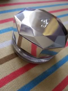
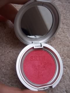
The packaging is shiny black, which does attract alot of fingerprints (SO annoying!) But unlike NARS packaging, there is a clear window embossed with their logo (and if you tilt it, it looks like there's a logo under it!). I like the window so you can see the color quickly. The sides of the square are pushed in, like if you played with a soft candy chew and pressed in.

Illamasqua eyeshadow retail 20$ for .07 oz.

My first foray into Illamasqua doesn't leave me terribly impressed, but I am eager to try their lipgloss, foundations/primers and blush and reserve judgement until then.

Sunday, October 4, 2009

Review: Majolica Majorca Jeweling Palettes

Ah, review long overdue! The Jeweling eye palettes came out the summer collection of this year, long ago in the makeup world! They come is a range of 5 shades for roughly 420NTD -- 13 USD.
I had been excited to hear of a new eyeshadow series from Majolica, but then was mostly disappointed to hear the initial reports of the powdery texture and the usual pastel like shades. However, I wanted to pick at least one palette up to see how it really was...and ended up getting another as well.

But anyways, the colors I ended up getting were SV887 and GD886. After swatching all of them I thought these two had the best texture and pigmentation, even if they are for a sheerer look.
SV887 contains a shimmery white, a cool, purpled light pink, a medium silver and a darker gray.
The texture of the white was okay, a little chunky, the pink a bit chalky, but the other two great.
GD886 contains a gold tinged shimmery white, a pale buttercup yellow, a deeper bronze and a darker greenish brown.

The texture of all of them are a bit powdery, not atypical of Japanese eyeshadows. It's a very 'meh' texture, one that usually sucks when used with a brush but applies better with sponge applicators. If you use these palettes with a brush, you will be so disappointed! You MUST use these with sponges!

I like the color combinations of these two. Not overwhelmingly creative, like the Trick On palettes are, but they are very pretty and idiot-proof [trust me ladies, I would know ;-)].

Overall, if you're looking for a more office-friendly soft shaded palette, these are for you! If not, steer clear and keep your 13$ safe!

Sunday, August 30, 2009

Swatches: Erika F Comparisions

When I was in Taiwan this year, I saw quite a few eyeshadows that I thought could dupe the infamous Erika F from Lancome. Of course, in the name of blogging, I bought the two that I saw: Shu Uemura ME471 and Art Deco 45. Here's how they stack up:

ME471: The most pigmented of the three, and the most olivey. I guess that's obvious because its named Olive ME471. Amazing buttery texture, and shimmery.
Ombre Absolute 144 Erika F: Super glittery and most green, and also lightest. This has probably the most issues with fall out, and its worst vice is because of all the glitter.
45: This looks hideously warm next to the other two, very bronze. It doesn't on its own, but now that I have this next to Erika F, it's nothing like 144.

So far, the closest dupe for Erika F is Shu Uemura number 471 but it doesn't have the glitter and more green / silver that Erika F is.

The search continues...

Monday, August 3, 2009

Swatches: Anna Sui Glitter Eye Color Stick

[image from ichibankao.com]
Apologize for the no post yesterday, I was extremely busy trying to get everything ready for my flight back home! But yes, here we have sheer color sticks which are used for the major glitter. Its something not usually found in Japanese lines [where they aim for soft, finely milled shimmer] so I thought it would be interesting.

Actually....I think it's a waste of 25USD. You see the pigment on my arm? It took ALOT of layers to just get that much color! While I know the main purpose isn't for the color, it's still disappointing. I mean, why make so many colors if they won't show up properly when applied?

You can see from the photo that there are flecks of serious glitter in there, and I suppose you'd just swipe on your lid, blend and top with shadow. I doubt these would hold up though if you have problems with creasing. They have a decent texture, on the dry side but the glitter doesn't grit when rubbed against the skin.

I'd give these a pass, and remember: All Anna Sui products are heavily scented with rose!

Saturday, June 20, 2009

Swatches: Lunasol Summer 2009 Palettes


[image from A Touch Of Blusher.blogspot.com]
Lunasol released two palettes [Layer Bloom Eyes if I'm not wrong, but I might be] for summer 2009, in Summer White Gradation [ex01] and Summer Pink Gradation [ex02]. They are both LE.

I'm really disappointed in these. In EX01, the two lighter shades are very shimmery, which would be OK, but they are also sheer. And the darkest shade, the dark olivey brown, is chalky. Meh.


In EX02, the most pigmented shade is the upper left, which is the palest and most shimmery! The rest are so sheer, and satin finish. Even my aunt commented on how sheer it was, and she doesn't even usually pay attention to makeup!
Each of these retail for about 57USD, but Lunasol, Lunasol, what a disappointment you have created this summer 2009.

Thursday, May 7, 2009

PSA: MAC Mineralize Shadows Repromote?

I was at my MAC store at the other day, and in the Mineralize shadows displays was Sea & Sky, Play on Plums, Engaging, and Fresh Green Mix! Weird! These were released in July last year--they can't still be there as they're already at CCOs! What's the deal? I also saw a huge box labeled Fresh Green Mix & Play on Plums in a cabinet. Are these being repromoted? I have no clue. I was dying to get out of there as the ladies paid me no attention at all and I was very irritated. I can't think that they are being repromoted so soon, and because there is Color Craft this July!

What do you think?

Thursday, April 23, 2009

Obsession: Yellow Eyeshadow

Just like my insatiable love of teals/aqua shades for eyeshadows and nail polish, yellow is another obsession of mine. It's supposed to be 'in' for this year's spring [which may be true as MAC is releasing a Bright Future in Style Warriors collection [May] and it's BRIGHT canary yellow!] Check out my current stash!

Here we have:
The She Space [TSS] About Face Shot the messenger, which is a really pretty true yellow gold and great shimmer
MAC Goldmine, which is a slightly more brassy than Shot the Messenger, but again, great shimmer
MAC Golden Lemon, Shimmery! And it has chunks of more shimmer. Very prone to fallout but beautiful bright yellow! [I think of this color when I hear yellow, perfect!]
Shu Uemura ME300, Great shimmery yellow, with great texture. Seems to have a bit of green to it!
MJMJ YE323, Matte with coarse sparkles. This is interesting, bad payoff on brush though, slightly lighter and more green tinged than ME300.
Anna Sui 800, which I wouldn't really classify as a yellow. Sure it's yellow, but once swatched it's more of a cream shade. What can I say--appearences can be decieving. I rarely reach for this one!


Friday, April 10, 2009

Haul: CPs and CCO

Hi all! My friend recently came back from Taiwan, and I asked her to CP 2 items:

Jill Stuart Jelly Eyes in Amethyst Mauve 19 [I had told her this was the alternative to the shiny onyx they released in spring, in case it was out of stock]
and
Shu Uemura ME300 eyeshadow [bright, kickass yellow!]

And then I went to the CCO and got:
MAC Polar Opposites Mineralize eyeshadow duo

Here are the pics!


And swatches:


Friday, March 27, 2009

Swatches: Taupe Eyeshadow

kmbirkiel on MUA caused quite the stir when she figured out that shu uemura ME850 and the fabled MAC French Gray are really similar!

In my opinion, French Grey looks...more taupey...not as warm I suppose, not to mention not as shimmery as ME850.

But you can judge yourself:


Shadows used:
MAC French Grey
Shu Uemura ME850
Shu Uemura IR850
MAC Smoke & Diamonds
MAC Sweet Sienna [pigment]

I think I need to get copperplate to compare them all too as well...

Sunday, March 15, 2009

Review: New York Color MarblEyes Eyeshadow, Tiger's Eye, Aquamarine


These--along with the NYC Chroma Face Glows--caused something of a splash in the makeup world when they were launched. People who had them touted then as dupes to the MAC Mineralize line, for only a few dollars! So women went crazy looking for them, because, like the Sonia Kashuk Highlighting Brush, the new line wasn't at every store. And the swirls make them look so pretty! Especially Aquamarine (left) oooh...ahhh....[is that only me who does that?]

Is it worth the mass hunt?

Well...no.

Let's start with the outside. For NYC--notoriously cheap, hit and miss line--it's typical. Easy to manufacture, flip top lid and information on the back. It's just decent, though I give them props for a clear lid to easily identify the color inside. I don't like the dome however--it's hard to organize with it!

The back of the packaging: (Nice touch that it's colored to kind of represent the shade!)


So, alright, by this point you're paying 5$ (I'm not exactly sure of the price, it's under 5USD$ though, because I swapped for this) for decent packaging and how pretty it looks in the pot.

On to texture and color payoff. Swatches:

Super sheer! I mean, I can kind of understand--MAC said itself that minerals were supposed to make the product sheer, but layer well--but I've layered this 3x. Still barely any color! The texture is curiously hard too--not at all like the MAC ones they're trying to dupe. So you'd need a pretty stiff brush to apply and get decent pigment.

Well, it wasn't an issue to me...but the colors were! Such a disappointment! What looked like a good wash shade in Tiger's Eye turned out to be just a bunch of gold sparkles on the eye, and the promising smoky tealy blue turned into flat gray. I can't describe how the blue looked -- it looked almost chalky, maybe? But it wasn't chalky, it just looked...grey, flat and off. That's all I can say to describe it. It doesn't help that within an hour the color just fades away completely on me. Yuck!

So now you pay 5$ for sheer, hard to get pigment that fades, decent packaging and pretty swirls. Sorry NYC, please try again if you want to unseat MAC...

Sunday, March 8, 2009

Review: Skinfood Vitamin Eyeshadow in 7


So this is the eyeshadow that I was super excited to receive, both because of the hot pink color and that it's the first SkinFood item I've tried. Well, for so many raves about their BB creams and skincare, it's eyeshadow kind of falls short and leaves me disappointed.


As you can see, the packaging is really cute, with a cardboard esque label on the back--reminiscent of Stila, (and with the cute emblem on the front!). It's bigger than MAC, as you can see from the picture above. Although, since SkinFood is a Korean brand, I'm not even sure the name of this particular shade is indeed 7...But bonus points for there being a mirror and the imprint on the shadow doesn't fade at first swatch.
Isn't that cupid cute? Heehee. The formula on these is actually really good--on my hand. It's pigmented and blendable, though it's not exactly silky. It also is a little bit sheer, which I don't like--I wanted this to pop! But I could live with it if it didn't have really obvious bad points. It doesn't even crease!

I'm not sure what the price point is on these--but if it's SkinFood, I would say around 10$. Definetly not worth it for me--read on to see why, but I would be surprised if anyone bought this at all!
Compared with MAC bright Fuschia (the right)


Compared with MAC bright Fuschia (bottom).
When I put this on, even over UDPP, it shows up all of three seconds a lovely, bright, hot pinky red. Then it just disapears! I blink, and then all I see is this pale, sheer dust. What happened to the bright obnoxious shade I was loving? I've never had this happen to me before.

So I tried again, over a bronze eyeshadow and UDPP. It stays on for a little bit more before fading...

I give SkinFood credit for making such a lovely shade, points for great packaging, but they seriously need to redo this formula. Perhaps I will use this as a sheer blush...

Monday, February 16, 2009

Review: Kanebo KATE Dual Carat


Last year, when I took a month long trip to Taiwan, I went on a drugstore product binge. Kanebo KATE's eye shadow palettes were not excluded, and I happily picked up Dual Carat in PU-1. Based on reviews from other sites, this was supposed to be a great eyeshadow for roughly 10USD.

Is it that hot? Do you need it *now*?

Well....not so much. No. Definitely not.

Lets start off on a good note. The packaging is definetly very pretty--simplistic, sleek in design. My favorite part is that the clear plastic part is faceted, so when the light hits it, it looks like a true gem. Here's a good picture:

See what I mean? Also, here is the back:

I don't know what all that Japanese says but I find it nice that on the box (not pictured, long since tossed out) there is a diagram that tells you to use the darker shade nearer to your lashline, and the lighter shade as an all over shade.

Now, on to texture. I don't know what went wrong Kanebo! While this doesn't crease on me (over UDPP), and the texture is amazingly silky, soft, and blendable, it's chalky on me.

Chalky!

All that gorgeous shimmer, deep purple goodness and icy blue of Duo Carat PU-1?


Wasted!

It looks so horrible on me, and I doubt it's the colors' fault. Its the formula! Even seeing how great it looks swatched on my hand (and 'great' here is an understatement, you can see how its only semi-pigmented and prone to dull color), on my eyelids, its a great big fat yuck.

But if chalky dull eyeshadow floats your boat, Dual Carat comes in 7 different colors including blues, blacks, browns, bright hot pink, golds, and creams. Available for 17$ at Ichibankao.com.

LinkWithin

Related Posts with Thumbnails